Guest Post: How brands are using minimalism to break all the rules
Guest Blogger: Ricardo Teco
I started to read about Minimalism 4 years ago after I saw a video in YouTube about Japanese minimalism. It was really interesting to see how less can be more in many ways. Minimalism is marked by the removal of extra design elements, paring down until what is left the core or intention of the creation at hand. This applies to everything from music to architecture to, of course, branding.
Nowdays you can find a new minimalism design just around the corner. The focus on space, simplicity and beautiful typography is refreshing. Maybe that’s the reason why it is so popular in marketing right now.
Back in the 90’s the design trends were so different. I could say it was a time when brands used to take risks and were not afraid to experiment with colors, crazy designs and even crazy packages for their products. Remeber those crazy and colorful Trix ads?
Well, those days are gone. Now the trend is Minimalism, and brands are using it to sell more and reach new audiences.
As an example, these three brands are taking minimalism to another level:
Common Projects
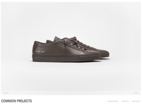
Common Projects is a luxury footwear brand founded by Prathan Poopat and Flavio Girolami in 2004. Its operations are based in two locations, with design and business operations taking place in the US, and production in Italy. Poopat and Girolami founded their brand after searching for a pair of premium casual shoes that would feel luxurious to wear without sacrificing style or timeless appeal.

All their products are made with high quality materials and clean aesthetics. The Instagram feed is clean and minimalistic. With more than 326k followers, the account does not follow anyone. The company’s website also follows the minimalistic style: white, clean and empty spaces.
Bang & Olufsen
Bang & Olufsen is another brand that is making history by applying minimalism to all their products. The Danish brand is a high end luxury consumer electronics company that designs and manufactures audio products, television sets, and telephones.
Each detail is important. That is the main reason why they keep all their designs really simple and clean. For them, less is more. They don’t need to add many buttons to the tv controls or many details to their speakers. Their collection called ‘Contrast’ is the perfect example. All the materials used, the company used Kvadrat-made material, but mixed with different fibers, to create a new blend that is thinner and silky. New visuals contrast earth tones with wood, nut-brown leather and grays, providing a naturalistic palette.

Aēsop
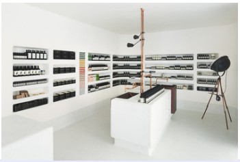
Aēsop uses simplicity in everything. From their hand washers to their stores around the globe. This brand is not also cruelty free and vegan, it’s also minimalist. They have products for personal care and fragrances.
The brand has decided to keep it simple in everything they do. The goal is to give their customers a great experience, no matter if they shop online or in physical stores. And the decor is really simple: no distractions, no noise, no colorful walls; basically, it’s just their products. Everything is clean a quiet.

In 2020, more and more brands are using minimalism in their favor. Talking about digital marketing, minimalism is almost tailor-made for digital advertisement. Since it depends heavily on cohesion between text and imagery, minimalism lends itself well to social media sites that allow a blend of both.
Branding is of course important for any company: whether you just have a website or a social media presence. Minimalism is one of the most modern branding trends and creates gorgeous, intuitive, pared-down and beautiful designs.
